Travis Lowdermilk’s guide to user-friendly application development from user experience
Core Ideas:
1 – User-centered design requires us to ask users what they don’t like about our apps. Sometimes we don’t want to hear their criticism or assume we know what they will say. Being willing to receive feedback means being willing to hear criticism.
2 – The mission statement has the power to remind the team of its purpose. For example, the hospital’s mission is to provide the highest standards of patient care and service. It is up to the developer team to seek simple and innovative solutions for the hospital staff to fulfill their mission.
3 – A persona is a personality-determining element that helps you remember who the application is being created for. It is a fictional character that consists of the personification of its real users.
4 – The proximity principle (based on Gestalt) states that we perceive relationships between objects that are closer. Because of this fact, it is easier to see patterns of application operation when items are grouped according to their functions.
5 – The overall goal of a usability study is to measure the efficiency of a feature or set of features of your application. To do this, you should define metrics, such as execution time or the number of errors, or a combination of these measures.
About the author:
Travis Lowdermilk has been developing custom software for healthcare, architecture and business for over 18 years. He creates solutions for web, mobile, touch, and voice. This book shows how usability and user-centered design effectively change the way people interact with your application.
Foreword
Based on several discussions I have had with developers from around the world, I can safely assume that I am not alone. So I decided to write this book to help developers better understand their users. This book is not intended for user experience (UX) professionals or professional designers. Rather, my goal is to help developers understand the fundamental practices of user-centered design, usability, and user experience.
This discussion should be your launching pad into the world of usability experts. You will learn the motivations, terminologies, and strategies for judging the success (or failure) of an application. My hope is that with this knowledge, you will have much more self-confidence to start studying users in a more meaningful way.
The human-computer interaction industry is vast and includes decades of scientific research. It would not be possible to cover all aspects of what is now known as usability. However, this book is full of great examples (which are also practical) to help you take the first step.
With this book, you will learn how to:
– Implement user-centered design and usability practices;
– Deal with different types of users and their unique personalities;
– Create a vision that will be essential to the success of your application;
– Create a plan that will help you navigate the development process and avoid costly mistakes;
– Stimulate creativity and create compelling applications using common design principles;
– Gather feedback and make design decisions that are informed.
Chapter 1 – Our World Has Changed
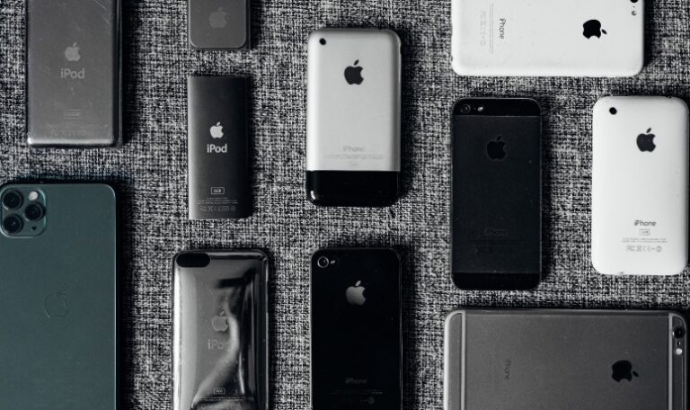
Then, in a dramatic fashion, he showed a phone that he and his company had been working on for more than five years. Journalists were frantically capturing images of the device, quickly sending them to every corner of the world. The man demonstrated how it was possible to zoom in on images with a simple finger pinch gesture and browse the music library by dragging a single finger across the screen. He ran through several applications: a notepad, a calendar, a compass, and detailed maps. No one had seen anything like it before. The phone looked like a product of science fiction. Yet it was very real and so small that it could fit in his pocket.
It would not be enough for my applications to have fast loading times or a list of facilities. My users would want the iPhone. Not just the product, specifically, but what it represented. It was intuitive, minimalist, and engaging; now my users had a great example of how everything should work. New ways of interaction became part of conversations, and terms like Multi-Touch and NUI (Natural User Interface) instantly became part of the developers’ language.
A year later, Apple unveiled the App Store for the iPhone, sparking an explosion in app development. Developers began to compete in a saturated market where users had thousands and in most cases hundreds of thousands, of options. Companies such as Google, Facebook, and Amazon were also expanding their extensive development platforms.
We can improve our process by implementing the user-centered design practices presented in this book. By focusing on usability, we save time and create applications that meet the needs of our users. Although our development environment may be different from yours, you will find that the practices detailed in this book can be modified to suit your needs or circumstances.
Chapter 2 – What is User-Centered Design
The entire discipline of usability and all its underlying methodologies represent a conglomeration of several scientific disciplines. Through the use of ergonomics, psychology, anthropology, and various other fields, usability is grounded in scientific knowledge. It is far from being a form of subjective reasoning or conjecture.
The user-centered design process works against subjective assumptions about user behavior. It requires evidence that your design decisions are effective. If the user-centered design is used correctly, your application will result in actively engaged users. So any design decision that takes into account watching and listening will not be based on whim or personal preference.
UCD (User-Centered Design) does not mean wasted time or money. Devoting time to appropriate user-centered design practices can be a difficult task. The very nature of UCD requires thought and observation. Let’s face it: if you’re spending development time reflecting on design choices, it can feel like you’re not making progress. Also, if your usability research reveals design problems, you may end up having to discard previous efforts. This can give the impression that you are going backward.
User-centered design requires that we ask users what they don’t like about our applications. Sometimes we don’t want to hear their criticism or assume we know what they will say. Being willing to receive feedback means being willing to hear complaints, and no one likes to hear that they are doing a horrible job. Of course, Sally was only being “constructive” when she said that her app was “worthless”.
All this technological reasoning is good. However, it has nothing to do with customer needs, because we haven’t collected the user requirements yet. User-centered design helps us stay focused on the users’ core needs. It ensures that we get solid information first and prevents us from trying to make the problem fit the technology.
I admit that there are real technological constraints that we have to deal with, but developers often make the mistake of addressing these issues upfront. User-centered design helps us to progress in an appropriate way, starting from the user’s requirements towards our technological solution. It is an objective approach that ensures we accomplish tasks in the right order.
User Experience (UX) is one of the many focuses of the UCD. It includes the user’s entire experience with the product, including physical and emotional reactions.
Chapter 3 – Working with Users
It is easy to look at products like Google, Facebook, Twitter, Amazon, and Groupon (and this and that) and think that creating software is only about a great idea. We mistakenly believe that, just like Newton, an apple fell from the tree and hit these developers on the head, starting a digital revolution, as if by magic. So I see developers waiting for an apple to fall on their heads too, and I think to myself, “You know what? If they would just spend some time with people, they would probably get somewhere faster.”
Leonardo da Vinci, for example, had a notebook full of sketches and drawings of his definitive version of The Last Supper. It was not a case of simply sitting down one day and painting his masterpiece. He spent years sketching, erasing, and redrawing different ideas and concepts. Most of us are not even aware of these earlier sketches; all we hear about is the final painting, adored by millions.
What most users provide is an understanding of their own task flows. It is up to you to explain how you can expand this task flows with your programming skills. Educating users and introducing them to your process is your job. Teach them the correct terminology so that they can explain their needs properly.
By actively listening and guiding them, you can direct users to provide the information you are looking for. You must ask the right questions, and if you are not getting what you need, you must ask them differently. Be persistent.
Work hard at eliminating negative language and attitudes. Avoid the Fundamental Attribution Error which is the “tendency to explain people’s behavior by the way they are, rather than by the situation they are in.
Chapter 4 – Planning
A mission statement for the team is a great way to set the tone for your template. Without understanding what your team is trying to accomplish, how will it be possible to proceed with any project? A mission statement has the power to remind the team of its purpose. Furthermore, it provides a fundamental understanding of the work you are trying to accomplish. You can refer to your mission definition when you are making difficult decisions on a project.
Example. The hospital’s mission is to provide the highest standards of patient care and service. Our team’s mission is to provide simple and innovative solutions so that they can fulfill their mission.
Using our mission definition when we are evaluating our applications, we might ask ourselves:
– Is this app simple and easy to use?
– Is this application innovative? Can we implement newer technology to make it even better?
– Is this app an impediment or does it allow staff to provide the best possible care for our patients?
Showing users their requests in writing is a powerful tool. Many times I have been corrected by showing them my summary list containing their requirements. They say “Yes, I see that you thought this is what I needed, but actually, I need something different”. Documenting user requirements has saved me countless hours of wasted development time and avoided headaches.
Gathering user requirements is so vital to a successful project that I often refuse to write even one line of code before having several meetings with users to extract the requirements from them. Without proper communication and understanding between the developer and the user, it is impossible to create an efficient application. Documenting user requirements is the best way to foster this kind of communication.
Another useful tool is the workflow diagram or data flow diagram. I use workflow diagrams in projects that have a complicated sequence of steps to accomplish an action or when several people are involved to achieve a result. Workflow diagrams allow you to consider all the steps necessary for a user or group of users to complete an action.

Chapter 5 – Creating a Personal Manifesto
Here is another realization: you should not only have a general mission definition, but you should also have a manifesto for each project you are working on.
For example, instead of saying “I’m developing an app for travel,” a manifesto would state, “I’m developing an app that replicates the experience and adds the value of having a personal travel assistant.”
Ingebretsen says that software development company FiftyThree is a great example of how great products result from a clear manifesto.
“Paper is the home of your ideas” sounds like a great manifesto to me. This is a unique vision. Fifty-Three didn’t set out to create a design tool or a program for painting. They have developed an app, which gives the impression of being the perfect home for your ideas. It is a specific manifesto with a clear vision in mind.
Building a narrative. FiftyThree wanted Paper to be an app that allowed users to capture their ideas. They wanted it to have a broad appeal and not be limited only to professional artists. They believed that when people used Paper, their ideas would flourish, rather than being trapped by the limitations or complexity of the tools.
To do this, FiftyThree needed a story that was aligned with their manifesto. They had to clearly understand how Paper could accomplish what it had been designed to do. Developers and designers had to evaluate features and functionality to make sure they made sense in the context of Paper’s story.
Creating personas. One way you can extend your narrative is through the creation of personas. A persona is a personality-determined element that helps you remember who the application is being created for. It is a fictional character that consists of the personification of your real users.
Chapter 6 – Creativity and User Experience
The difference between user requirements and user experience goals can cause confusion. After all, shouldn’t a great user experience with our application be a requirement? Of course, it should; however it is better to have specific goals in mind. For example, we might consider some of the following questions:
– How important is load time? Would the user be willing to wait for items to load if it means we can provide a richer experience?
– How will users interact with the application? Will they use a touch-sensitive interface, voice, gestures, keyboard, mouse, or a combination of these? How will the type of input affect the way we present information to them?
– Should the application be fun to use? Do I want users to be amazed and surprised or do they expect something more consistent?
– What tone of language should I use to communicate with the user? Will it be comical, professional, encouraging, or full of vitality? Is the language chosen consistent throughout the application?
Drawing and sketching can have a positive impact on your creativity. Also, consider encouraging your users to draw. This can help them convey their ideas.
Freedom from constraints is essential for stimulating creativity. Step away momentarily from the work you are currently doing and consider spending some time exploring new projects, technologies, and interests.
If you are having trouble coming up with your own ideas, don’t be afraid to observe other people’s work and incorporate it.
Chapter 7 – Design Principles
The proximity principle is one of many principles defined in the Gestalt Principles of Perception. While you should study all the Gestalt principles, I find that the proximity principle has the most significant potential impact on your applications and requires the least amount of effort.
The principle states that we perceive relationships between objects that are closer together. Conversely, objects that are farther away would seemingly have fewer relationships. Because of this fact, you may see the proximity principle is referred to as the grouping principle. Basically, it is easier to see patterns of operation when items are grouped according to their functions.
This is why the proximity principle can have the most significant impact. By simply organizing and grouping items in a way that their function is described, you can significantly improve the user experience with your application.
Consider Microsoft’s Office suite of applications. In 2007, Microsoft introduced the Ribbon interface, which is a grouping of Office functions at the top of an application window. This interface resulted from the increasing confusion that many users were feeling about the location of certain Office features. Microsoft introduced the Ribbon as a way to place similar functions in a close relationship to each other.
The confirmation principle states that applications should require verification to prevent users from performing unwanted actions. The confirmation dialog for saving a document is a good example.
The principle of consistency, on the other hand, states that tasks in an application should work as expected. You should not invent new workflows to perform tasks that are already understood by the user.
Chapter 8 – Gathering Feedback
Receiving criticism is no fun. If someone tells you that they enjoy receiving feedback on their work, that person is lying. Being told that you have failed to do something, made a mistake, or gone in the wrong direction essentially means that you are not finished. It means you have more work to do. It means you are not perfect.
Here is my suggestion: we must learn to be tolerant of feedback. The best developers I know want to do what is right, no matter the consequences. Above everything else (sleep, money, or ego), they want to develop the best app possible. They realize that getting honest, quality feedback is the only way to get there, and here’s the secret – they actually ask for feedback. I didn’t say they like it, but they value it. These developers get their apps into the hands of potential users as quickly as possible. They ask users detailed questions and encourage them to be brutally honest. They research the market, watch their competitors, and review their apps to make sure they will provide a competitive advantage.
Many studies have been done to find out the magic number of people that make a sample statistically viable. Although there are some discussions about this issue in the market, the famous usability expert Jakob Nielsen believes that you can achieve the best results with a minimum of five users. He claims that most usability errors will be discovered by the first five users and that very little can be learned from that point on.
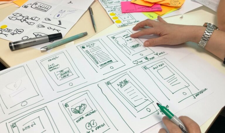
Storyboarding can lead you to make early decisions about the layout and process of your application. You will start to realize what concepts will and won’t be necessary to provide a good user experience. Show your storyboards to your users and make sure the workflow meets their needs. This is a great way to bring up any miscommunication and avoid costly design mistakes.
Chapter 9 – Usability Study
The overall goal of a usability study is to measure the efficiency of a feature or a set of features present in your application. To do this you should define metrics, such as the time to execution or the number of errors, or a combination of these measures. The study can also be combined with a survey to measure aspects that are difficult to observe, such as satisfaction or perceived value.
It may seem obvious, but before you can conduct tests, you will need to know what you are looking for. If you are developing a mobile app, don’t just hand people the phone to see if they will like it. Better results can be obtained with an organized approach that contains measurements. You will probably want to have the right participants, a prepared script, and a set of guidelines. This ensures that the data you collect is consistent and feasible.
The tasks will be the basis of your usability study. They represent the metrics that you plan to use. For example, you may decide to measure the time a user spends changing their profile picture or to search for an item. You can also count the number of queries required to locate a particular pair of shoes on a shopping site. Regardless of what the tasks or tasks are, make sure they can be quantified.
Chapter 10 – You Are Never Finished
When you start working in sync with users, you will save valuable time by getting yourself going in the right direction. I don’t know about you, but I hate having to rewrite code or throw away an hour of work. I feel foolish when I put my application in front of the user and realize that I missed something obvious, which makes the application unusable. It only takes a few situations like this to make you realize that you cannot create applications without the help of users.
Certainly, redefining the purpose of a code has its merits, and there is no need to reinvent the wheel with every project. However, this has its drawbacks. If we continually institute the same code for every project, we run the risk of implementing the same solution for every problem. It can become more difficult to provide new solutions to usability problems. We end up evaluating every user request as an exercise to prove that “we have code for it”.
If our application does not meet the users’ needs, we should ask ourselves some basic questions:
– What are we trying to accomplish?
– How are we adding value?
– What do our users love?
– What do our users hate?
I have had users give me suggestions that were so embarrassingly simple that I don’t know how I hadn’t thought of them before. After all, I am expected to be the expert. The truth is that it is impossible to see everything. Developing applications requires such an intense focus on the smallest details that I have to give up my ability to notice and think about everything.
To do the job right, you need help, and there is no better group of people to help you than the users themselves.
That is the beauty of the user-centered design approach. It protects us from failure at the opening of the curtain, the moment when we open the curtain and show our application to an unsatisfied group of users. She provides us with a roadmap that will maintain our empathy with users by continually focusing on their experiences.
FACTSHEET:
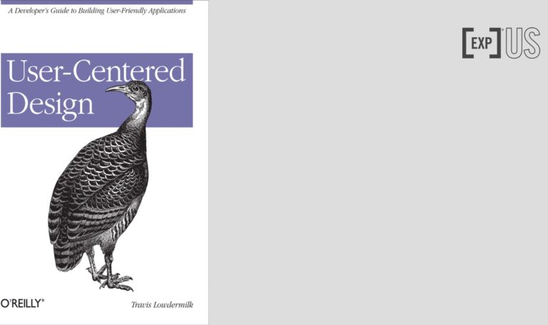
Title: User-Centered Design
Author: Travis Lowdermilk
Photos: Tron Le, UX Indonesia, Amélie Mourichon / Unsplash
Review: Rogerio H Jönck
![[Experience Club] US [Experience Club] US](https://experienceclubus.com/wp-content/uploads/2021/03/laksdh.png)


![[Experience Club] US [Experience Club] US](https://experienceclubus.com/wp-content/uploads/2021/03/logos_EXP_US-3.png)


